Microsoft Azure Marketplace has many free data sets. One way to get an idea of a data set is to explore it with Tableau, of which there is a free app:
Tableau Public. There is a couple of steps to get from a data set to exploration and then possibly to a dashboard, and I'll list them below.
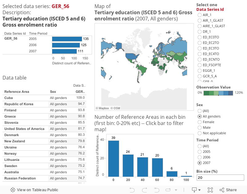
However, first, here is an example of Azure data exploration as a publicly shared dashboard. Data is
UNESCO Statistics data and reason for doing this viz was to understand a bit more what the data is. The main data set, 'Values', has no descriptions of what has been measured but only a reasonably cryptic 'data series id'. By selecting one data series id using radio buttons on the right, you can see at a glance
- name or description of the measure
- details of data in the data table
- quick overview on how global the measure in the map
- range and distribution of values in the histogram
So, the steps required:
- Use you Microsoft (former live ID) account to log in to Azure
- You also need a marketplace account, which is easy to create if you don't already have one
- Find an interesting data set browsing in here:
(note you can filter only free data sets from the selections at left)
Microsoft Azure Marketplace
- and when you find one, subscribe to the data using 'SIGN UP'
- Only after subscribing you'll see the 'Explore this dataset' link. Click it to see data fields and values in a separate 'data viewer'
- You'll see the main URL at the top of the data viewer, copy it:
https://api.datamarket.azure.com/UnitedNations/UNESCO/v1/DataSeries
- Assuming you have already downloaded, installed and launched the Tableau Public app,
make a data connection to the data. Select 'OData' and paste the URL you copied as the 'server'.
- Your Azure account key is needed to access the data. Copy it directly from the top of the Azure data viewer by clicking 'Primary Account Key' and paste it to the 'Account Key' box. The key can also be found from the 'My account' page.
- Now you'll see the fields of the data set. To see the content of the data, click 'New worksheet' icon at the bottom. Tableau will extract your data, so the more there is, the longer it will take. In this example I did not filter the data, but as there are only 174 rows, it does not take long.
And now we have Azure data nicely in Tableau. If there was only one table needed, this is where exploring with Tableau could start. However, in this data source, the data is actually organized into two tables, and this 'dataseries' one has only a bit more descriptive names for the actual data series. To get the actual measures, a new data connection in Tableau is needed.
- In Azure data viewer, click 'Values' and notice that there is now more than 300k of data. It may be a good idea to filter it to limit the time taking to extract the data, unless you'll need it all.
- In my example I filtered the data by setting 'TimePeriod' 'greater than or equal to' 2005. You'll see the updated number of rows in the viewer.
- Once happy, copy the query including the filter:
https://api.datamarket.azure.com/UnitedNations/UNESCO/v1/Values?$filter=TimePeriod%20ge%202005
- In Tableau, select 'Data' -> 'New Data Source' -> 'OData' and paste both the new query as well as your account key.
- Clicking the 'New worksheet' icon at the bottom starts the data extractions process, which will take somewhat longer this time.
- Once done, you'll see two data sources in the Tableau sheet. Next you'll need to connect them:
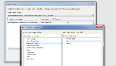
Select 'Data' -> 'Edit Relationships' . Make sure the 2nd data source, 'Values', is the primary and then the 1st data source, 'DataSeries' is the secondary.
- The common key between the data sets is the 'data series id'. However, the name of the field is different in the data sources. Hence, select 'custom' and 'add'. From the primary, select 'Data Series Id' and from the secondary select 'Id'. Close by clicking 'ok' and 'ok'.
Now you can start playing around with the data in Tableau. There are really good videos from which you can learn how to use Tableau (Public), so here are just some brief instructions.
Use the primary data source 'Values', here marked with red arrow in below picture, and pull fields from the left to the
shelves in the right.
After studying the data a bit, it becomes clear that some filters are needed. For example, pull the 'Unit' dimension to the 'filter' shelf and set it to 'percent'. Now all observation values should be percentages rather than counts. Also, limit 'age group' to 'non applicable', 'sex' to 'all genders' and select only one 'data series id' to study one measure at a time.
To use the 'Name' field from the secondary data set (DataSeries), always include the key, 'Data Series Id' from the primary data set to the chart: Pull 'Data Series Id' at least to the 'Details' box (highlighted with yellow), then you are able to include the 'Name' field from the secondary data source for example to the top line of the chart:
To make a map, first create a new worksheet from the bottom. Then right-click the 'Reference Area' field -> 'Geographic Role' -> 'Country / Region'. Then, pull 'Reference Area' to the 'Detail' box and you'll get a dot per country. From 'Show me' menu at top right, select map with colored areas. Add a measure such as sum of 'Observation value' to the 'color' box to see a quickly the data on a map!
If you have used the free Tableau Public app, you cannot save your workbook but in the Tableau Public server. It will be visible to all, but I think it can be saved as 'hidden'. However, if your main point was just to understand more of the data to use it within Azure etc, then you may not even wish to save the workbook but you have learned enough of the data to continue with other tools.
So, maybe there were more than just a couple of steps! :-) But honestly, I think Tableau is one of the best tools to explore and understand a new data set because it is easy to use. Also, after having done the data connections a couple of times, it is very quick too.